EcommerceRecruiter.com: an elite track record, a website that hides it
EcommerceRecruiter.com has closed ecommerce leadership searches for 66 named brands, and Harry Joiner has run the firm since 2005. A first-time visitor on a phone sees none of it: the headline repeats itself, the menu sits off screen and the only way in is a phone number 2.6 screens down. This concept puts the track record, two clear doors and a two-minute brief in the first screen, in the site’s own green, gold and Poppins.
Corey Frons · Prepared for EcommerceRecruiter.com · Independent work
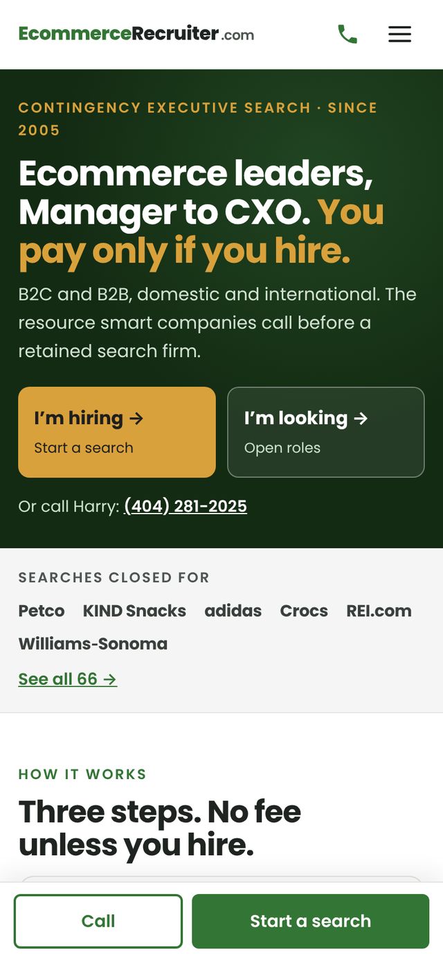 Homepage on a phone — tap to try it
Click through four screens
On the phone homepage, open the menu and use the pinned “Start a search” bar. On the track record, type a brand to filter the 66 clients. On “Start a search,” fill in the brief and send it: nothing leaves the page.
Desktop versions: homepage and Start a search — best on a laptop.
The first screen on a phone
Red pins mark the problems on the live site; green pins with the same numbers mark the fix. Tap either screenshot to see it full size.
 213213
Five seconds to “this firm can fill my role”
What a hiring manager sees before deciding whether to scroll.
- 1“For B2C + B2B B2C + B2B ecommerce”Manager to CXO, pay only if you hire
- 2Two logos; the menu button sits off screenOne logo, a call button and a working menu
- 3“Learn more” opens a staging server“I’m hiring” and “I’m looking” doors
The audit behind every screen
A UX health score of 59/100, 21 ranked opportunities, three task walkthroughs, a benchmark against Talentfoot, eCommerce Placement and ACCUR, Lighthouse and accessibility results, eight WordPress fixes, about an hour in all, a search-value calculator and a 90-day plan.
- 0 visits measured: the analytics plugin is installed but not connected
- “Learn more about us” sends visitors to a WP Engine staging address
- 66 client brands on the About page; no client list on the homepage
- 1.5 s on desktop and SEO 100: the site doesn’t need a rebuild, just a better first screen